
30 Data analysis methods in quantitative research
Data analysis is directed toward answering the original research question and achieving the study purpose (or aim). Now, we are going to delve into two main statistical analyses to describe our data and make inferences about our data:
- Descriptive statistics
- Inferential statistics.
Before you panic, we will not be going into statistical analyses very deeply. We want to simply get a good overview of some of the types of general statistical analyses so that it makes some sense to us when we read results in published research articles.
Descriptive statistics
Descriptive statistics summarise or describe the characteristics of a data set. This is a method of simply organising and describing our data. Why? Because data that are not organised in some fashion are super difficult to interpret.
Let’s say our sample is golden retrievers (population “canines”). Our descriptive statistics tell us more:
- 37% of our sample is male, 43% female.
- The mean age is 4 years.
- Mode is 6 years.
- Median age is 5.5 years.

Let’s explore some of the types of descriptive statistics.
Frequency distributions
A frequency distribution describes the number of observations for each possible value of a measured variable. The numbers are arranged from lowest to highest and features a count of how many times each value occurred.
For example, if 18 students have pet dogs, dog ownership has a frequency of 18.
We might see what other types of pets that students have. Maybe cats, fish, and hamsters. We find that 2 students have hamsters, 9 have fish, 1 has a cat.
You can see that it is very difficult to interpret the various pets into any meaningful interpretation.
Now, let’s take those same pets and place them in a frequency distribution table.
| Type of Pet | Frequency |
|---|---|
| Dog | 18 |
| Fish | 9 |
| Hamsters | 2 |
| Cat | 1 |
As we can now see, this is much easier to interpret.
Let’s say that we want to know how many books our sample population of students have read in the last year. We collect our data and find this:
| Number of Books | Frequency (How many students read that number of books) |
|---|---|
| 13 | 1 |
| 12 | 6 |
| 11 | 18 |
| 10 | 58 |
| 9 | 99 |
| 8 | 138 |
| 7 | 99 |
| 6 | 56 |
| 5 | 21 |
| 4 | 8 |
| 3 | 2 |
| 2 | 1 |
| 1 | 0 |
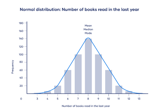
We can then take that table and plot it out on a frequency distribution graph. This makes it much easier to see how the numbers are disbursed. Easier on the eyes, yes?
Central tendency
A measure of central tendency is a single value that attempts to describe a set of data by identifying the central position within that set of data.
- Mode: The mode is the number that occurs most frequently in a distribution of values.
- Example: 23 45 45 45 51 51 57 61 98
- Mode: 45
- Median: The median is the point in a distribution of values that divides the scores in half.
- Example: 2 2 3 3 4 5 6 7 8 9
- Median: 4.5
- Mean: The mean equals the sum of all the values in a distribution, and then divided by the number of values.
- Example: 85 109 120 135 158 177 181 195
- Mean: 145
Now, in a normal distribution of data, the values are symmetrically distributed. Meaning, most values cluster around a central region. It has a normal “Bell Curve”. Remember the frequency distribution from above? We see in this histogram that it has a normal distribution.
But what if it is not bell-shaped?
Well, that would be called a skewed distribution.
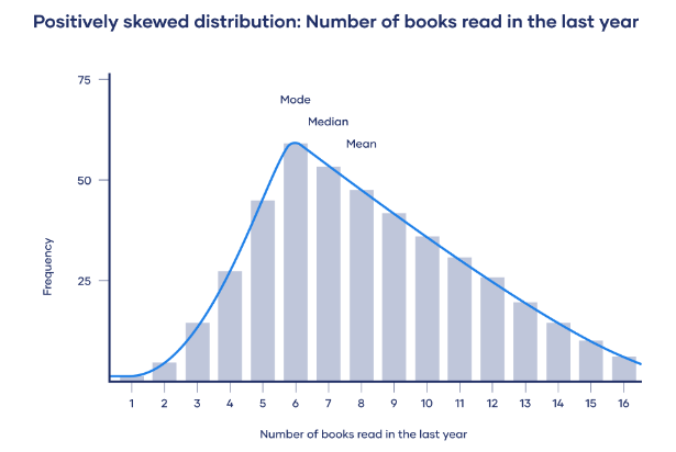
In a skewed distribution, more values fall on one side of the center than the rest of the values. The peak is off center. There is one tail longer than the other. The mean, median, and mode all differ from one another. Skew is bad. Remember that.
Here is an example of a positive skew. The distribution is skewed to the right (meaning, less values are to the left of the mode and more to the right). The longer tail is to the right.
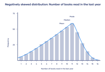
And here, we have a negative skew. The longer tail points to the left.
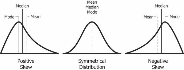
Here’s another example of symmetrical, positive skew, and negative skew:
Variability
While the central tendency tells you where most of the data points lie, variability summarises how far apart they are. This is really important because the amount of variability determines how well the researcher can generalise results from the sample to the population.
Having a low variability is ideal. This is because a researcher can better predict information about the population based on the data from the sample. Having a high variability means that the values of the data are less consistent. Thus, higher variability means it is harder to make predictions.
Here is an example. The researcher is investigating the amount of time spent on phone daily by various groups of people. Using random samples, the researcher collected data from three groups:
- Sample A: High school students
- Sample B: University students
- Sample C: Adult full-time employees.
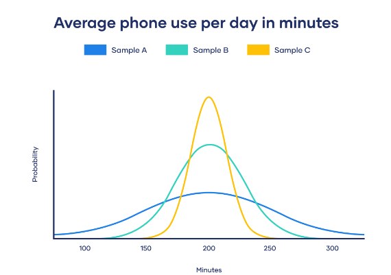
Taking a look at the samples, we see that all samples have about the same average phone use, at 195 minutes. That is the x-axis where the peak of the curves is shown.
Now, although the data follows a normal distribution, each sample has different spreads. Which has the largest variability? If you choose Sample A, you are correct. And, thus, Sample C has the smallest variability.
As we look at normal distribution and variability, this leads us to the concepts of range as well as standard deviation.
Range is simply the highest value in set of data minus the lowest value.
- Example: 12, 24, 41, 51, 67, 67, 85, 99
- Range: 99-12 = 87
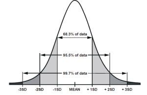
A normal distribution is defined by its mean and the standard deviation. The standard deviation is how much the data differs from its mean, on average.
Let’s look at that another way. Any normal collection of values will simply tend to cluster toward the mean, yes? If we have a homogenous (similar) sample or precise inclusion criteria for the sample, the data will probably not have huge variations. The standard deviation (SD) tells us the degree of clustering related to the average (mean). The SD summarises the average amount of deviation of values from the mean. We want this fairly small, and the standardised value of the SD is usually around 2-3 SDs. If values fall outside of the standard deviation, this may mean there is an error in a collected value somewhere or that something is “off”. An SD can be interpreted as the degree of error when the mean is used to describe an entire sample.
In the diagram below, we see that 95.5% of our data falls within 2 SDs of the mean. That’s good! And, 99.7% falls within 3 SDs. This is consistent with a normal distribution of our data.
Descriptive statistics (percentages, means, SDs) are most often used to describe sample characteristics. This helps to document features such as response rates. They are seldom ever used to answer research questions – inferential statistics are used for that purpose (Polit & Beck, 2021).
Additional resources
Statistics intro: Mean, median, & mode
P-values and significance tests
Correlation
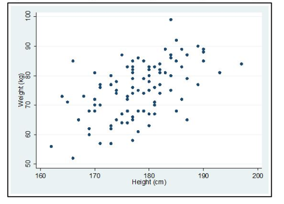
Relationships between two research variables are called correlations. Remember, correlation is not cause-and-effect.
Correlations simply measure the extent of relationship between two variables. To measure correlation in descriptive statistics, the statistical analysis called Pearson’s correlation coefficient I is often used. You do not need to know how to calculate this for this course. But, do remember that analysis test because you will often see this in published research articles. There really are no set guidelines on what measurement constitutes a “strong” or “weak” correlation, as it really depends on the variables being measured.
However, possible values for correlation coefficients range from -1.00 through .00 to +1.00. A value of +1 means that the two variables are positively correlated, as one variable goes up, the other goes up. A value of r = 0 means that the two variables are not linearly related.
Often, the data will be presented on a scatter plot. Here, we can view the data and there appears to be a straight line (linear) trend between height and weight. The association (or correlation) is positive. That means, that there is a weight increase with height. The Pearson correlation coefficient in this case was r = 0.56.
Inferential statistics
When thinking of research in general, and how researchers can make inferences from their sample population and generalise it to the general population, we are referring to inferential statistics. We are making inferences, or predictions, based on probabilities.
Inferential statistics are used to test research hypotheses.
Lucky for you, we will not explore all of the inferential statistical tests via analyses that can be done. However, we need to look at a couple of general key concepts.
Hypothesis testing
The key concept about testing a hypothesis, is that researchers are using completely objective criteria to decide whether the hypothesis should be accepted or rejected. That is, it is either supported with statistical evidence or it is found to not be supported.
Suppose we hypothesise that diabetic patients who received online interactive diabetic diet education would have better control of their blood sugar levels measured by 2-hour postprandial blood glucose than those who did not. The mean 2-hour postprandial blood glucose for the intervention group is 165 for 25 intervention diabetics and 186 for control group diabetics. Should we conclude that our hypothesis has been supported? Group differences are in the predicted direction, but in another sample, the group means might be more similar. Two explanations for the observed outcomes are possible:
- The intervention was effective in educating diabetics.
- The mean difference in this sample was due to chance (sampling error).
In the first explanation of an effective educational program, that is considered the research hypothesis. The second explanation is the null hypothesis, which means that there is no relationship between the independent variable (our intervention of online interactive diet education) and the dependent variable (our outcome of better control of postprandial blood glucose).
Now, remember, our hypothesis testing is a process of only supporting the prediction. There is no way to fully demonstrate that the research hypothesis is directly correct. However, it is possible to show that the null hypothesis has a pretty high probability of being incorrect – meaning, if we can show that something did happen, then we may be able to reject the null hypothesis and states that there is evidence to support the hypothesis.
Hypothesis testing simply allows researchers to make objective decisions about whether measured results happened because of chance, or if the results were actually because of hypothesised effects. That is key! Remember that last statement.
Type I and Type II errors
The next step in understanding hypothesis testing is learning about Type I and Type II errors. Researchers have to decide (with the help of statistical analysis of their data) whether or accept or reject the null hypothesis. Back to the statement above that I told you to remember – researchers must estimate how probable it is that the group differences are just due to chance. At the end of the day, researchers can only state that their hypothesis is probably true or probably false.
In making this decision, researchers can make errors. These errors can be that their reject an actual true null hypothesis, or that they accept a non-true (false) null hypothesis.
A type I error is made by rejecting a null hypothesis that is true. This means that there was no difference, but the researcher concluded that the hypothesis was true.
A type II error is made by accepting that the null hypothesis is true when, in fact, it was false. Meaning there was actually a difference, but the researcher did not think their hypothesis was supported.
Hypothesis testing procedures
In a general sense, the overall testing of a hypothesis has a systematic methodology. Remember, a hypothesis is an educated guess about the outcome. If we guess wrong, we might set up the tests incorrectly and might get results that are invalid. Sometimes, this is super difficult to get right. The main purpose of statistics is to test a hypothesis.
- Selecting a statistical test. Lots of factors go into this, including levels of measurement of the variables.
- Specifying the level of significance. Usually, 0.05 is chosen.
- Computing a test statistic. Lots of software programs to help with this.
- Determining degrees of freedom (df). This refer to the number of observations free to vary about a parameter. Computing this is easy (but you don’t need to know how for this course).
- Comparing the test statistic to a theoretical value. Theoretical values exist for all test statistics, which is compared to the study statistics to help establish significance.
Some of the common inferential statistics you will see include t-tests (compares differences in two groups), analysis of variance (ANOVA, which compares differences in three or more groups), and chi-squared (X2) test (measures differences in proportions). Do not worry about knowing how to calculate these.
| Differences | Inferential statistics | Descriptive statistics |
|---|---|---|
| Population | Used to make conclusions about the population by using analytical tools on the sample data. | Used to qualify the characteristics of the data. |
| Testing | Hypothesis testing | Measures of central tendency and measures of dispersion are the important tools used. |
| Inferences | Is used to make inferences about an unknown population. | Used to describe the characteristics of a known sample or population. |
| Measures | Measures of inferential statistics include t-tests, ANOVA, chi-squared test, etc. | Measures of descriptive statistics are variances, range, mean, median, etc. |
Statistical significance versus clinical significance
Finally, when it comes to statistical significance in hypothesis testing, the normal probability value in nursing is <0.05. A p=value (probability) is a statistical measurement used to validate a hypothesis against measured data in the study. Meaning, it measures the likelihood that the results were observed due to the intervention, or if the results were just due by chance. The p-value, in measuring the probability of obtaining the observed results, assumes the null hypothesis is true.
The lower the p-value, the greater the statistical significance of the observed difference.
In the example earlier about our diabetic patients receiving online diet education, let’s say we had p = 0.05. Would that be a statistically significant result?
If you answered yes, you are correct!
What if our result was p = 0.8?
Not significant. Good job!
That’s pretty straightforward, right? Below 0.05, significant. Over 0.05 not significant.
Could we have significance clinically even if we do not have statistically significant results? Yes. Let’s explore this a bit.
Statistical hypothesis testing provides little information for interpretation purposes. It’s pretty mathematical and we can still get it wrong. Additionally, attaining statistical significance does not really state whether a finding is clinically meaningful. With a large enough sample, even a small very tiny relationship may be statistically significant. But, clinical significance is the practical importance of research. Meaning, we need to ask what the palpable effects may be on the lives of patients or healthcare decisions.
Remember, hypothesis testing cannot prove. It also cannot tell us much other than “yeah, it’s probably likely that there would be some change with this intervention”. Hypothesis testing tells us the likelihood that the outcome was due to an intervention or influence and not just by chance. Also, as nurses and clinicians, we are not concerned with a group of people – we are concerned at the individual, holistic level. The goal of evidence-based practice is to use best evidence for decisions about specific individual needs.
EBP project application
At this point, you can interpret findings in the studies you are reading! You might not be an expert, and that’s okay.
- Can you find the p-value?
- Did the researcher discuss clinical significance?
- Was there a large/small sample size? And does that make a difference in the study?
Update your Synthesis of Evidence Table with specific key statistical findings, as well as your Results section in the poster.
Additionally, begin your Discussion section.
- What are the implications to practice?
- Is there little evidence or a lot?
- Would you recommend additional studies?
- If so, what type of study would you recommend, and why?
Critical appraisal: Interpretation of findings, implications, and clinical significance
- Were all the important results discussed?
- Did the researchers discuss any study limitations and their possible effects on the credibility of the findings? In discussing limitations, were key threats to the study’s validity and possible biases reviewed? Did the interpretations take limitations into account?
- What types of evidence were offered in support of the interpretation, and was that evidence persuasive? Were results interpreted considering findings from other studies?
- Did the researchers make any unjustifiable causal inferences? Were alternative explanations for the findings considered? Were the rationales for rejecting these alternatives convincing?
- Did the interpretation consider the precision of the results and/or the magnitude of effects?
- Did the researchers draw any unwarranted conclusions about the generalisability of the results?
- Did the researchers discuss the study’s implications for clinical practice or future nursing research? Did they make specific recommendations?
- If yes, are the stated implications appropriate, given the study’s limitations and the magnitude of the effects as well as evidence from other studies? Are there important implications that the report neglected to include?
- Did the researchers mention or assess clinical significance? Did they make a distinction between statistical and clinical significance?
- If clinical significance was examined, was it assessed in terms of group-level information (e.g., effect sizes) or individual-level results? How was clinical significance operationalised?
References
Polit, D. & Beck, C. (2021). Lippincott CoursePoint Enhanced for Polit’s Essentials of Nursing Research (10th ed.). Wolters Kluwer Health.
Vaid, N. K. (2019) Statistical performance measures. Medium. https://neeraj-kumar-vaid.medium.com/statistical-performance-measures-12bad66694b7
This chapter is adapted from “Part II: Data analysis methods in quantitative research” in “Evidence-Based Practice & Research Methodologies” by Tracy Fawns, used under a Creative Commons Attribution-NonCommercial-ShareAlike 4.0 International License, except where otherwise noted.
