
4 Activity 4 – Correlation and Regression in jamovi
Last reviewed 19 December 2024. Current as at jamovi version 2.6.19.
Overview
In this section we look at procedures that can be used to analyse the influence of multiple continuous variables (predictors). We will be modelling the variance that these predictors explain in our dependent variable (criterion). We revisit the concepts of correlation and regression, and look more specifically at how partial and semi-partial correlations are used to explain the relative importance of predictors in our analyses. We also examine the jamovi procedures for performing correlation and multiple regression analyses.
Learning Objectives
- To understand how a design can be implemented using one or more continuous independent variables (i.e., predictors)
- To revise the concepts of correlation and regression
- To introduce and practise jamovi procedures for conducting correlation and regression analyses
- To introduce the concepts of partial and semi-partial correlations
Correlation: Basic Concepts
Essentially, all the methods of analysis we look at in this course do the same thing. We want to take a number of observations, and understand how those observations covary. That is, do scores on the DV/ criterion depend, in some way, on scores on one or more of the IVs/ predictors? Are the scores related? Moreover, we want to know how effectively we can predict a particular person’s score on the DV/ criterion based on their observed scores on each of the IVs/ predictors.
By looking at the broader approach of correlation and regression, we can use this same strategy to look at many variables which occur naturally (i.e., outside the lab). While our analyses of variance (ANOVAs) require us to focus on categorical independent variables (that group people into discrete categories), correlational methods can be used to implement the same kinds of analyses for all types of variables, from those which have only two possible scores (i.e., dichotomous variables – such as handedness) to those in which an infinite number of scores are potentially possible (i.e., continuous variables – such as age, height or weight). We can even use correlational methods to deal with categorical (i.e., group) variables as in ANOVA. (Although it’s a bit tricky – in general, ANOVA is still the most efficient analysis to use if all of your independent variables are categorical. If some are categorical and some are continuous, correlational methods may be used.)
Let’s focus on only continuous independent and dependent variables for now. The overall model for correlation involves taking measurements for each participant in the analysis, on multiple variables. Each of these variables has a mean score. We are interested in the extent to which the scores for any two variables are consistent in how they vary (or ‘deviate’) away from the means. This is what we mean by covariance. Positive covariance is when, for most people, scores on the two variables move in the same direction, so participants’ scores on both variables tend to both be above the mean, or both below the mean, or both close to the mean. Negative covariance is when the scores on the two variables move in opposite directions, so if participants score higher on one variable, they tend to score lower on the other, and vice versa (if they score lower on the first variable, they tend to score higher on the second). When there’s a covariance of zero, it means that how the participants score on one variable doesn’t relate to how they score on the second.
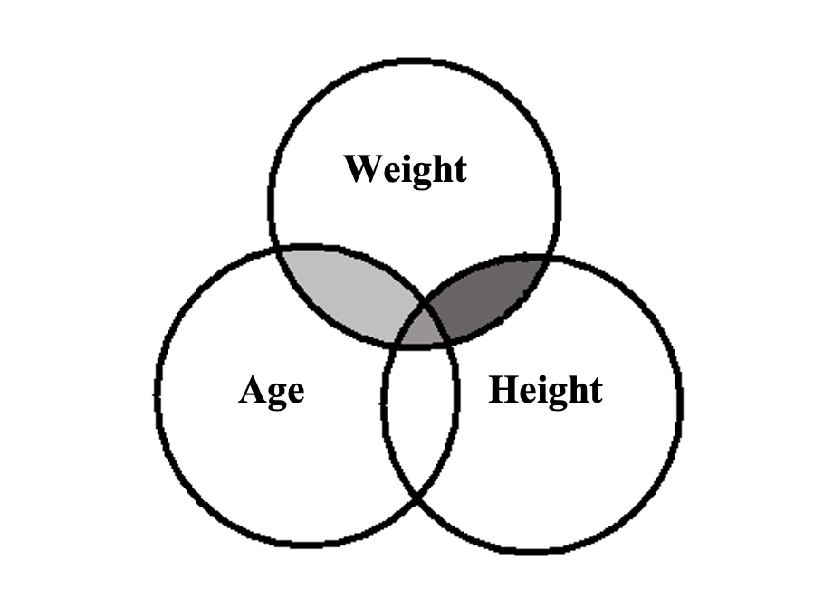
Consider the following Venn diagram. Each ‘bubble’ represents the variance of participants’ scores on a given variable. The degree of overlap among the bubbles represents the amount of covariance – that is, the extent to which scores vary together. (The Venn diagram shows the existence of the covariance, but we do not yet know the direction as positive or negative.)
Figure 4.1
Venn Diagram of Covariance between Weight, Age and Height
Regression: Basic Concepts
So far, we have been talking about correlation, and how it allows us to see the extent to which two variables are related. With regression, we go one step further with the data, and talk about how one variable can predict scores on another. That is, we can specifically ask: “If my height is value A and my weight is value B, what would you predict my age to be?” In regression, we fit a linear model to the data, and use that to predict scores on the criterion from values on one (or more) predictors.
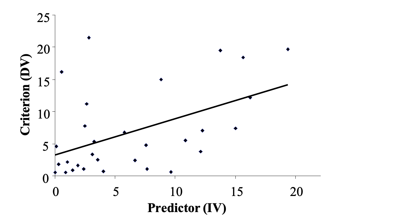
In simple regression, which is what you will do today, you examine only one predictor and one criterion. So when you fit a linear model to the data, it will literally be a ‘straight line’ applied to the scatterplot. This straight line is a ‘line of best fit’, meaning that the points on the scatterplot are as close as possible to the line. The line is calculated using the least squares criterion. That is, the sum of the squared differences between each individual data point and the regression line (residuals) will be at a minimum. An example looks like this:
Figure 4.2
‘Line of Best Fit’ or Least Squares Regression Line (LSRL) Applied to a Scatterplot
To jog your memory, there are several aspects to a straight line:
- the gradient or slope (denoted by b1 or b, or β1 if the equation is standardised)
- the y-axis intercept (denoted by b0, or a, or sometimes c; or β0 in a standardised equation)
- the predictor variable score (the x-axis score, denoted by x or X), and of course
- the predicted criterion (outcome) score (the y-axis score, denoted by Ŷ or Y’)
So, you end up with an equation for the straight line which can be written in multiple forms, e.g.:
Although we’ve calculated the b (or β) weights in this model such that they provide the best possible fit of the data, it is feasible that they could still be a pretty bad fit! Therefore, we also run an analysis to check the degree of fit of the model to our data. Specifically, we calculate R2, as well as an accompanying F test to check for significance. When R2 is converted to a percentage (by multiplying it by 100), it tells us the percent of total variance in the criterion that is explained by the model/ predictors. In simple regression (where there is only one predictor), R2 is equal to r2 in correlation, and it is interpreted the same way. If we derive the square root of R2, we get the Pearson correlation coefficient i.e., r. However, when we have more than two variables (i.e., more than one model predictor) as we will later on, the square root of R2 gives us the multiple correlation coefficient, i.e., R.
Exercise 1: Correlation and Simple Regression Using jamovi
The Effect of Stress on Eating Difficulty
A clinical psychologist is interested in the effects of psychological stress on eating difficulty. They noticed that the sort of people who report high levels of stress also seem to be those who have eating difficulties, such as a fear of fatness and an over-idealisation of thinness. The psychologist asked ten university students to complete a 10-item self-report questionnaire measuring stress (total score ranging from 0-40) and a 14-item self-report questionnaire assessing eating difficulty (which measured traits such as ‘fear of fatness’ and ‘idealisation of thinness’; total score ranging from 0-42). Higher scores on the questionnaires indicated greater stress and more self-reported eating difficulty, respectively. The researcher hypothesised that people who tend to experience stress will also tend to experience greater eating difficulty (Hypothesis 1). At the end of the day, however, the researcher is most interested in being able to predict eating difficulty on the basis of self-reported stress levels, where they expect that greater stress will predict higher self-reported eating difficulty levels (Hypothesis 2).
Part 1: Hypotheses for Correlation and Simple Regression
Table 4.1
|
Student |
Stress |
Eating Difficulty |
|
1 |
17 |
9 |
|
2 |
8 |
13 |
|
3 |
8 |
7 |
|
4 |
20 |
18 |
|
5 |
14 |
11 |
|
6 |
7 |
2 |
|
7 |
21 |
5 |
|
8 |
22 |
15 |
|
9 |
19 |
26 |
|
10 |
30 |
28 |
Go to a version of Table 4.1 formatted for accessibility.
Part 2: jamovi for Bivariate Correlation and Regression
- Click on the Variables tab on the far left of the menu ribbon. In the first row, in the Name column, type in the name of the first variable – Stress. In the second row, in the Name column, type in the name for the second variable – Eating Difficulty. Click the Edit menu option and ensure that both variables have their Measurement type noted as Continuous.
- Click on the Data tab and enter the data for each variable for the ten students. When you’ve finished, save your data in a file called “Eating” to your area on the H: home drive or somewhere safe.
- To create the scatterplot, you’ll need to install another jamovi module. Click on the Analyses tab and then on the + Modules box on the far right of the Analyses menu ribbon. Click on jamovi library and under Available search for a module called scatr and install it.
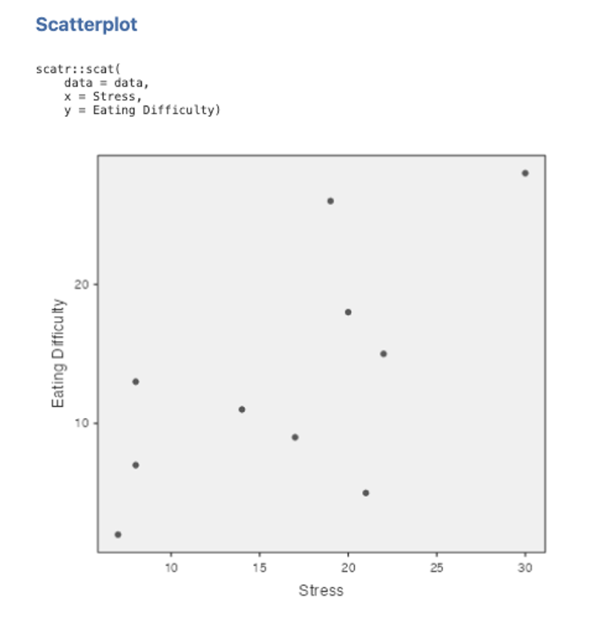
- Now go to the Exploration box on the Analyses menu ribbon, and under the scatr subheading select Scatterplot
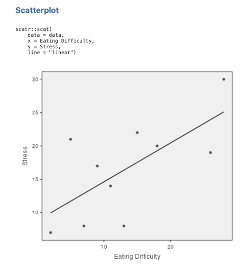
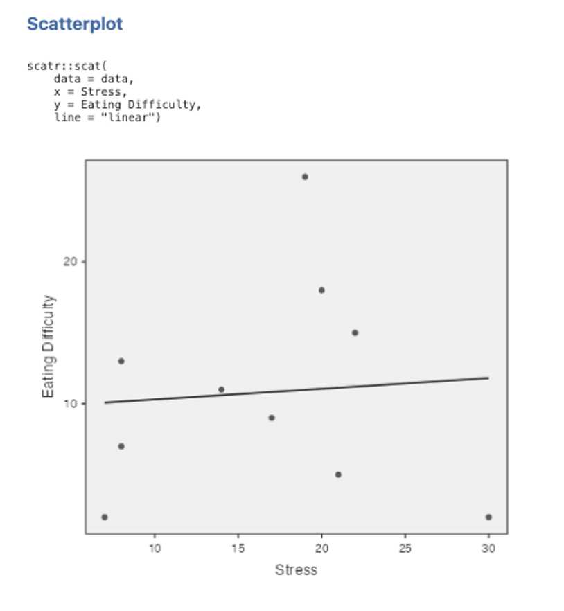
- Move Eating Difficulty into the Y Axis box using the arrow key. Put Stress into the X Axis box. You will get a scatterplot like the one below.
Figure 4.3
Note. If your output does not show the syntax, you can toggle it on by accessing the settings menu by clicking on the three dots on the right side of the jamovi ribbon, and clicking syntax mode.
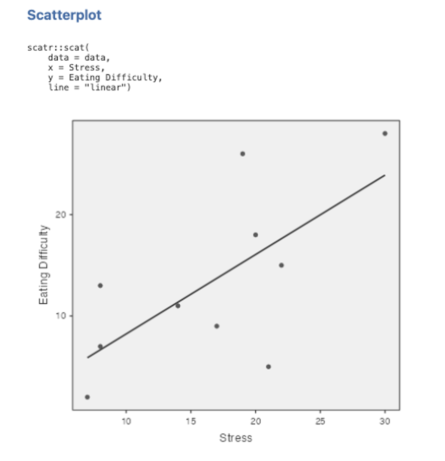
6. To fit the regression line, click on Linear under the Regression Line options on the left side of the Scatterplot set up box. Your scatterplot should look like the one below:
Figure 4.4
7. Try plotting the data again using Eating Difficulty as the x-axis variable instead of Stress. To do this new scatterplot, you need to go back to point 3 above, but this time put Eating Difficulty in the X axis box and Stress in the Y axis box. Everything else will be the same. Think about what this means in terms of the differences between the regression of Y on X and the regression of X on Y.
Figure 4.5
8. Now calculate the correlation between Stress and Eating Difficulty. Go to the Analyses tab and from the menu ribbon select Regression then Correlation Matrix. Select the variables you require (i.e., Stress and Eating Difficulty) and click on the arrow button to move these into the right-hand box for inclusion in the analysis. Make sure Pearson is ticked in the Correlation Coefficients section. Under Additional Options tick the checkboxes next to Report significance and Flag significant correlations. Ensure that under Hypothesis the box Correlated is checked as this will give us a two-tailed significance test, as compared to one-tailed tests in the positive or negative direction only. Our results output will look like the below:
Figure 4.6
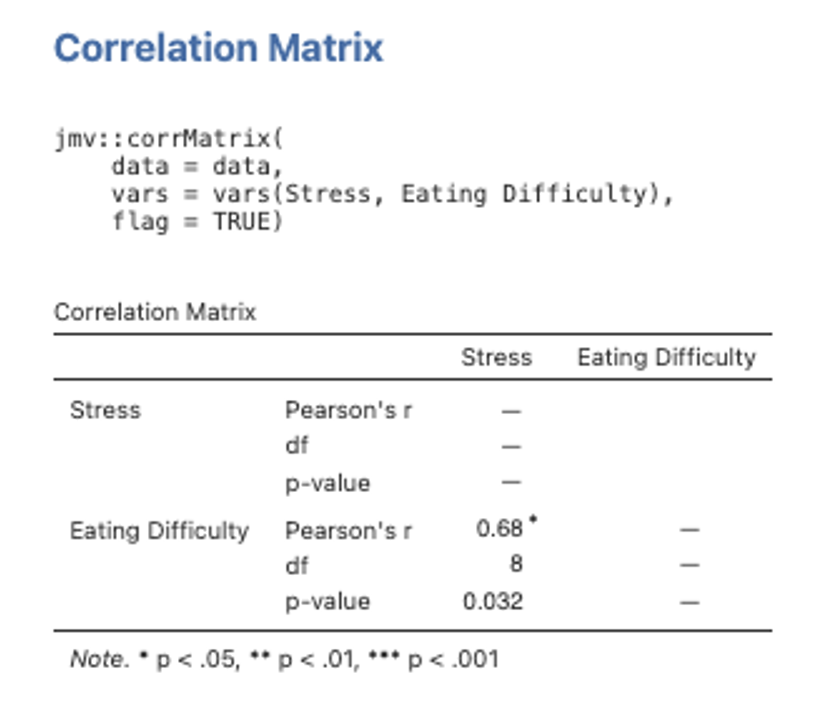
Note. To adjust the number of decimal places for the p values or the other numbers, you can access the settings by clicking the three dots on the far right of the menu ribbon in jamovi. For some versions jamovi also will give you the N (sample size) instead of the df for the correlations. When reporting correlations, the degrees of freedom are N – 2. So for N of 10, df = 8.
9. Note that by default, jamovi uses a two-tailed test of significance here, which is appropriate when the direction of the relationship cannot be specified in advance (i.e., it provides a more conservative test of the relationship).
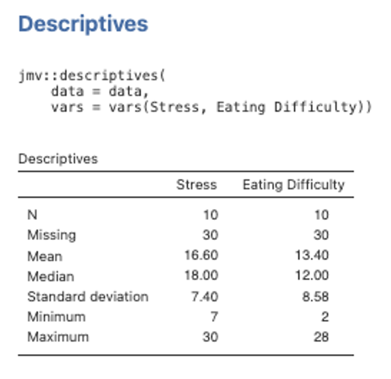
10. Also be aware that this table is NOT in APA format! Usually we seek to combine the information provided regarding the descriptive statistics and intercorrelations for variables into a single table in the text when reporting results (see Format Expectations workbook for an example of this). Head to the Exploration menu on the Analyses menu ribbon and then select Descriptives. Move both Stress and Eating Difficulty variables across to the right side box. The default descriptives options here will give us what we need (mainly the means and standard deviations). The table will look like the one below.
Figure 4.7
11. Run a bivariate regression analysis by selecting the Analyses tab, then Regression then Linear Regression. Select Eating Difficulty as the Dependent variable and Stress as the Covariate variable. Note that in jamovi, continuous predictors are labelled covariates and categorical predictors are labelled factors.
Under the Model Fit drop down menu select R, R2 and Adjusted R2 under Fit Measures. In the Model Coefficients drop down menu, under the Standardized Estimate heading, we want to select Standardized estimate and Confidence Interval (set to 95%), and we can also select Omnibus Test > ANOVA test. Finally, under the Save dropdown menu we can ask jamovi to save Predicted Values.
Part 3: Inspect the Output
Think through what the multiple R, R2 and adjusted R2 all mean conceptually.
a) How do you account for the difference between R2 and adjusted R2 in this case?
b) Make sure you understand what this analysis of variance is testing. It may help to think about what the SSregression and SSresidual are measuring.
c) Why is the F ratio evaluated with df of 1 and 8?
d) Note that the F test for the significance of R2 is equivalent to the t-test on the regression coefficient b and β for bivariate regression cases (i.e., F = t2). This is also equivalent to the t-test on r.
Figure 4.8
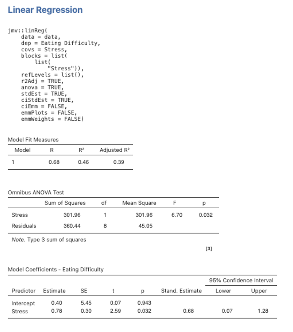
If you now go back into the Model Fit for this regression analysis and select Overall Model Test > F test you will see another ANOVA pop up next to the R2. Because we have only one IV, the overall model F and the F test for the IV are the same, and they have the same p value as the t-test for the IV – they are all testing the same relationship between our one IV and the DV. To avoid redundant reporting, we will be guided by APA conventions – we won’t just report all the different ways jamovi can think of to show us the results. Let’s work through a few different ways of looking at the results here in Part 4.
Part 4: Write Down the Unstandardised and Standardised Regression Equations
(from the values derived in the coefficients table above). That is, you will need to substitute in the numerical values for b1 and b0, and β1 and β0, into the equations below:
Unstandardised Regression Equation:
What variables do x/X and Ŷ/ zŶ represent in each equation?
In the unstandardised equation, x represents _________________________________, while Ŷ represents _____________________________________________________.
In the standardised equation, zX represents __________________________________, while zŶ represents ____________________________________________________.
Part 5: Using the Unstandardised Regression Equation, Calculate the Predicted Score for Participants 2 and 8.
Check your calculations against the predicted values produced in jamovi (from point 11 in Part 2). Look back in your data file and you will see that jamovi has created a new variable Predicted Values. Check the values for students 2 and 8 to see if these match your predicted scores.
Part 6: Linking the Results Back to the Hypotheses
Were the researcher’s hypotheses supported?
Part 7: Edit your Data File so That Participant 10 Scores 30 and 2 – Rather than 30 and 28 – on Stress and Eating Difficulty, Respectively
See what effect this has on the correlation coefficient (r), the regression line applied to the scatterplot, and the regression coefficient (β). Note that when you fit the regression line it is almost parallel to the x-axis and the regression coefficient shows stress to no longer be a significant predictor of eating difficulty. Likewise, the correlation between the two variables is now very weak (i.e., r = .07). What does this tell us about the relationship between these two variables? What sort of regression line might provide a better fit to the scatterplot? Think carefully about what this indicates.
REMEMBER TO CHANGE THE SCORES BACK WHEN YOU’VE FINISHED THIS EXERCISE!
Figure 4.9
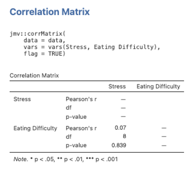
Figure 4.10
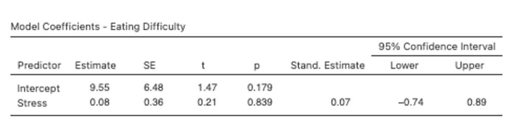
Figure 4.11
Part 8: Write Up the Results for the Correlation and Simple Bivariate Regression
- Describe the regression analysis that was performed, identifying the criterion and predictor.
- Report the zero-order correlation conducted between the criterion and predictor (this is known as a validity), stating its significance and direction of effect. If the model involves a number of predictor variables, this is usually done in the text with reference to a table that contains the means, standard deviations and zero-order correlations for all the study variables. However, if there are only a very small number of predictors – which we have in this case (i.e., only one) – then these values can also be given in the text as statistical notation. Be sure to report the relevant Ms, SDs, r(df) and p.
- Describe the analysis of regression. That is, describe the proportion of variance in eating difficulty that was accounted for by stress (i.e., R2 expressed as a percentage in the text) and state the significance/ non-significance. Provide the statistical notation for the test of significance and significance level at the end of this sentence i.e., F(df) and p. If confidence intervals (CI) were available for this whole model statistic, these would also be presented here (following the p-value notation).
- Describe the unique contribution of the individual predictor, stating its significance and direction. Report the relevant β, t(df), p, and 95% CI associated with this.
As a reminder:
- Statistical notation in English/ Latin letters needs to be italicised (e.g., r, F, t, p), while that in Greek (e.g., β) appears as standard text. Likewise, notation for “95% CI”, as well as subscripts and superscripts are presented in standard text (i.e., these do not appear in italics).
- Inferential statistics (e.g., F, β, t), correlations (r) and confidence intervals should be presented to two decimal places, while p-values go to three. Since the effect size (e.g., R2) will already be taken to two decimals before it is converted into a percentage (e.g., R2 = .23 = 23%), these are left as whole numbers. Only in cases when the %s are all very low and need to be differentiated, do these get reported to two decimals (and consistently so for all).
- Descriptive statistics such as means and standard deviations are given to the number of decimals that reflect their precision of measurement. In our case, means and standard deviations should be taken to one decimal place for reporting.
- Values that can potentially exceed a threshold of ±1 (e.g., M, SD, F, t), should have a 0 preceding the decimal point. However, values that cannot potentially exceed ±1 (e.g., r, β, p, 95% CI for β), should not have a 0 before the decimal.
- The direction of effect for an individual predictor should also be reflected in the positive or negative valence of its reported β and t-value.
- Confidence intervals should span the β-value correctly. I.e., a significant negative β will likewise have two negative CI values, a significant positive β will have two positive CI values, and a non-significant β-value (whether positive or negative) will have a negative lower bound CI value and a positive upper bound CI. In all cases, the β-value itself should be positioned directly in the middle of the reported CI value range (minus rounding considerations).
- Degrees of freedom (df) for a correlation value are: (N – 2). The df for an overall regression model are: (Regression df, Residual df), where these are found in the ANOVA output table. Finally, df for a t-value are: (Residual df), also found in the ANOVA table.
Test Your Understanding
Describe the underlying model of regression and correlation, including how these techniques are used to describe overlapping variance in variables of interest. Use a diagram to illustrate your answer.
