
Chapter 6: The Three P’s & Social Welfare
Learning Objectives
After completing this chapter, students should be able to:
-
Revisit the concept of allocative efficiency.
-
Describe the difference between Pareto efficiency and the Kaldor-Hicks principle.
-
Review demand and supply basics.
-
Estimate and evaluate benefits using willingness-to-pay in efficient markets.
-
Estimate and evaluate costs using opportunity cost in efficient markets.
Microeconomics Foundations and CBA
In this chapter we will revisit some core concepts already discussed in the earlier chapters of the book including allocative efficiency and Pareto efficiency. To ensure we are effectively capturing the benefits and costs in the evaluation of an intervention we must effectively be able to measure the impacts on markets. This chapter covers impacts in non-distorted markets, highlighting how input or output markets can be used to evaluate the benefit and costs of a policy or project directly.
Revisiting Efficiency and Cost-Benefit Analysis
In this section we will revisit some of the core microeconomic concepts that provide the foundation of welfare theory discussed in Chapter 1. To evaluate whether a proposed policy or project will improve the social surplus, we identified that any project with a net social benefit ( ) greater than zero improves the total social benefit (i.e., social benefits exceed social costs). Specifically, although there can be winners and losers involved in policy or project, as long as the net benefit is greater than zero, the project should be undertaken as it improves total social welfare. This is because a positive net social benefit indicates the capacity to make an unambiguous improvement in welfare by compensating losers so that no-one is worse off after implementation of the project. For mutually exclusive projects, the project with the largest net social benefit should be undertaken as it provides the largest gain to society. The goal of this approach was to identify the potential for Pareto improvement.
In a perfectly competitive market, allocative efficiency happens automatically. Assuming the absence of market failure any project with a net social benefit greater than zero achieves allocative efficiency. If a market is efficient and no market failure exists, then an intervention by government is not necessary as it would reduce the social surplus.
When evaluating a policy or project from a social perspective, we are expecting the analysis to capture or correct market failures. Consequently, in this chapter we intend on identifying whether we should include an impact in our social CBA based on the effects observed on the market and how to use changes in social surplus to monetise impacts. If the social surplus increases under a policy or project, it is considered an increase the welfare of society and therefore the policy should be undertaken.
Kaldor-Hicks Criterion
Cost-benefit analysis from a public sector application aims to ensure the best allocation of public resources. The public sector also aims to evaluate whether the changes in social surplus improve the welfare of society. Accordingly, one concept fundamental to cost-benefit analysis is the Kaldor-Hicks Criterion. Indirectly we have identified the Kaldor-Hick compensation criterion in previous chapters where we discussed compensation between winners and losers. Remember that a Pareto improvement is a situation where at least one person is made better off without making anyone else worse off. The Kaldor-Hicks compensation criterion occurs when those who are made better off by a policy or project could in theory compensate those who are made worse off to produce a Pareto improvement. In cost-benefit analysis, if the net social benefit is greater than zero ( ) there is an ability to compensate the losers by redistributing the benefit gains from the winners. The emphasis of the Kaldor-Hicks criterion is on the in theory component of the concept. Actual compensation does not actually have to occur to meet the compensation criterion – the requirement is that the winners from a policy should be able to potentially compensate the losers for their loss of welfare, and still be better off. This compensation criterion is the basis of welfare economics, as a policy with a positive net social benefit increases the welfare of society.
Key Concept – Kaldor-Hicks Compensation Criterion
Kaldor-Hicks compensation criterion states that a policy is more efficient as long as there is a net gain to society as this enables compensation between winners and losers of a project, resulting in a net gain to society. Therefore, a change is “socially desirable” if it means at least one person is made better off, and the gains to that person made better off are sufficient to compensate the loser (shown through a positive change in the social surplus). When compensation occurs, it leads to an actual Pareto improvement.
Example 6.1
Example: Kaldor-Hicks Compensation Principle
Suppose the State Government is considering building a high-speed railway into outback Queensland. Table 6.1 below lists the benefits and the costs of the project to those who have standing in the project.
| Stakeholder | Benefits | Costs |
|---|---|---|
| Train Company | $100 million | |
| Local Residents: | ||
| – Environmental degradation | $20 million | |
| – Noise | $15 million |
In this instance the net social benefit is greater than zero (= $65 million). To build the railway tracks under this project would not be Pareto efficient. Although there is a net gain of $65 million, the local residents are made worse off by the project.
However, as  this project meets the requirement for the Kaldor-Hicks criterion. There is an ability to compensate the local residents (losers) by taking some of the gains from the train company (winners) and re-distributing the income to the local residents.
The Kaldor-Hicks compensation criteria implies that there is potential for compensation. The compensation process may not actually happen when left to private agents in a market. However, from a public sector perspective there are instruments available to implement compensation. Specifically, the taxation system and welfare systems can be useful to policymakers for the redistribution of gains or losses from a policy. It is realistic for a CBA analyst to consider methods for compensation when evaluating a policy or project from a public sector perspective.
Case Study: The Short-lived Carbon Tax in Australia

In July 2012, the Australian Federal Government introduced a carbon pricing scheme under the Clean Energy Act 2011. This “carbon tax” was expected to increase prices across a range of goods and services. Conceptually, the increase in prices caused by the carbon pricing scheme was aimed at shifting consumer preferences away from heavily carbon polluting goods and services and push consumers towards those that were considered “cleaner” or used renewable energy processes.
However, this form of tax often has significant negative impacts on those at the low end of the income distribution. In this instance, low-income households were likely to spend a larger proportion of their income on the carbon tax than those on higher incomes – negatively impacting their overall welfare. The government of the time decided to use the compensation principle to redistribute income. Specifically, changes to income taxes were implemented through increasing the tax-free threshold, increases to pensioner and welfare payments. Discussion was also extended to credits towards electricity bills for aged pensioners.
This highlights the potential for policymakers to implement compensation under the Kaldor-Hicks criteria through systems already available. However, compensation is often unlikely to happen in practice.
Limitations of the Kaldor-Hicks Compensation Criteria
It is important to note that we utilise the Kaldor-Hicks compensation criteria in cost-benefit analysis through identification of increases in social surpluses. But there are a few limitations analysts should be aware of:
(1) Compensation does not actually always occur: This raises ethical and social concerns about those groups potentially affected by a policy or project. In the carbon pricing case study above, if the Federal Government did not actively intervene and compensate low-income households, those households would have paid a larger proportion of their income to the tax and their overall personal welfare could have been negatively impacted.
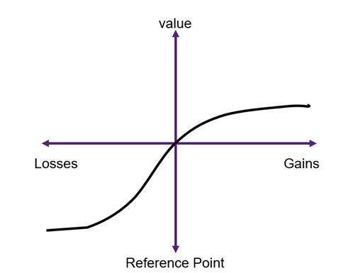
(2) The compensation principle does not consider the relative wealth position: Behavioural economics highlights the concept of prospect theory. Prospect theory suggests that individuals tend to experience a stronger negative impact when faced with losses in income as compared to the positive effect associated with equivalent gains in income. In other words, the pain of losing a certain amount of money is greater than the pleasure derived from gaining the same amount of money, which can be explained by the notion of loss aversion. This applies to the losses and gains involved in cost-benefit analysis. Each individual has a different reference point that determines the values they attach to their wins and losses (see Figure 6.2 for an illustration)
(3) It must be possible to appropriately estimate the WTP/WTA of those affected by the policy: Again, this assumes homogeneous groups of individuals. It is often assumed that the losses are the same for all those who are negatively impacted. This is a firm assumption that makes compensation in applied cost-benefit analysis difficult.
Direct Market Impacts
For the purpose of this book, we will focus on the impacts in direct markets – those markets that are directly impacted by a project, program, or policy intervention.[1] For CBA in general, benefits and costs are usually measured from those sources where the impacts can be effectively observed – specifically on markets where transactions are evident. There are two types of markets we deal with – input and output markets. Benefits are measured from output markets and costs are measured from input markets. The relationship between input and output markets is illustrated in Figure 6.3.
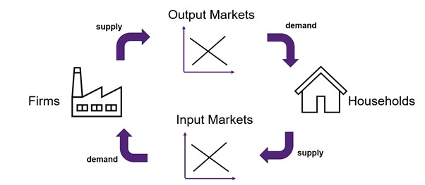
To evaluate the impacts on input and output markets from a CBA project, it is best to refresh our understanding of the concepts of willingness-to-pay and opportunity cost. For example, if a farmer was considering a sustainable tree plantation, the direct output market under consideration is the market for timber or wood as the farmer can sell the wood in the market (a benefit through income). A direct input market would be the water market, as the farmer would need to purchase water for the trees (a cost of production).

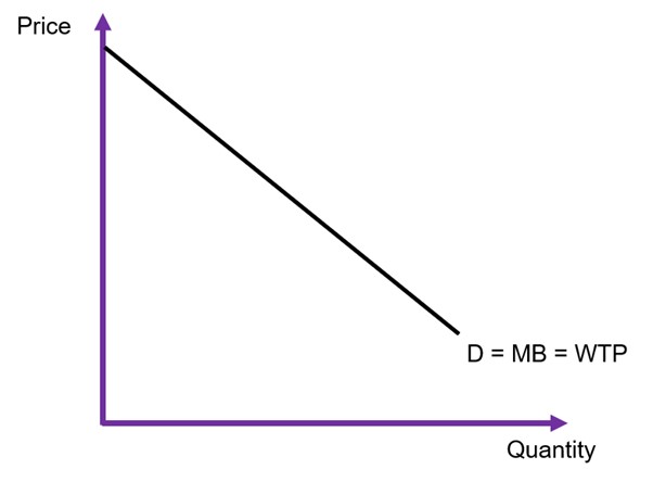
Willingness-to-Pay – Measuring Benefits
Benefits flow through output markets. An output market is a market where goods and services are exchanged for consumption. For example, if a farmer is considering building a new honey farm, the resulting honey from the farm would be sold on the honey market for consumption by households.
In cost-benefit analysis, benefits are measured by the willingness-to-pay (WTP) in the output market. WTP is easily identified by the demand curve in a market (see Figure 6.5). A consumer’s willingness-to-pay is also the same as their marginal benefit (MB) from consumption of a good or service. The demand curve is downward sloping following the law of demand – as price increase, the quantity demanded will decrease. To keep things simple in this analysis, we assume that demand curves are linear and can be expressed as:
- demand function

- inverse demand function

It is crucial to be able to rearrange the format of the demand curve between the direct and inverse demand functions as the inverse demand function is used for plotting on a graph as  (price) is on the y-axis. To highlight this relationship, it is important to note that
  is the slope of the direct demand function and
  is the slope of the inverse demand function.
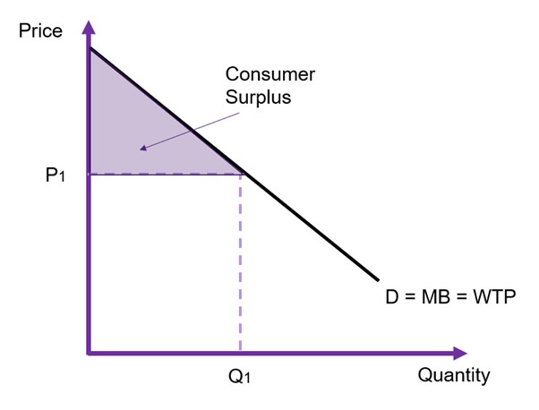
To evaluate any changes in benefits, we must calculate the changes to consumer surplus. Consumer surplus is the gain to consumers from consuming the good or service. The total shaded area of the triangle and the rectangle in Figure 6.6 represents the total willingness-to-pay.
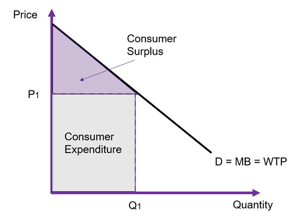
However, it is easier to remember that the consumer surplus is the area between the price paid by consumers and the demand curve (the WTP). This between the price and the curve as illustrated in Figure 6.7. We can calculate the consumer surplus by calculating the area of the triangle between the price P1 and the demand curve.
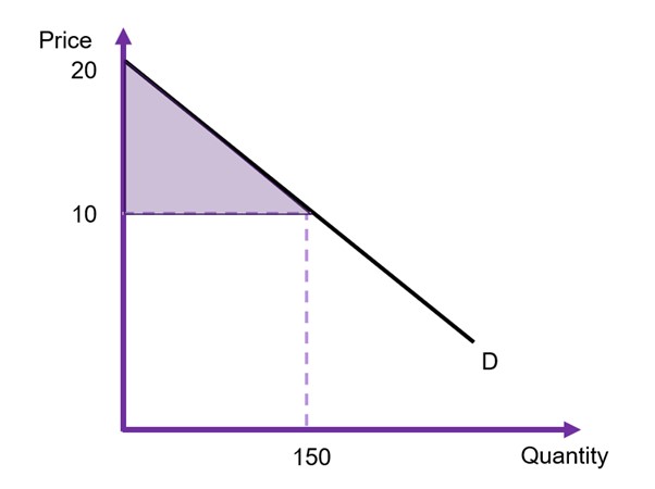
Example 6.2
Example: Calculating Consumer Surplus
Assuming the intercept is $20, the price paid by consumers is $10 and the total quantity traded on the market is 150 units as illustrated in Figure 6.8 the consumer surplus can be calculated as
![\begin{align*} CS & = \frac{1}{2} \times [length \times height] \\ & = \frac{1}{2}(150 \times 10) \\ & = 750 \end{align*}](https://uq.pressbooks.pub/app/uploads/quicklatex/quicklatex.com-722c894a0cc4882332432a7c682b1078_l3.png "Rendered by QuickLaTeX.com")
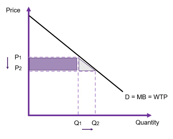
In CBA, we are interested in the change in consumer surplus from the implementation of the policy or project. Consequently, we can consider what happens when we increase or decrease the price. In Figure 6.9, we decrease the price from P1 to P2. This increases the quantity demanded. Consequently, we can identify the shaded areas (the purple rectangle and grey triangle) as the change in consumer surplus caused by the change in the price.
Opportunity Costs – Measuring Costs
When estimating the cost of a policy or project we use the input markets. Input markets are resource markets. When measuring costs of a policy or project, we look at the economic well-being of producers which requires the assessment of the opportunity cost of production. The opportunity cost is the value of the next best alternative that we give up in order to allocate the relevant resources towards the policy or project.
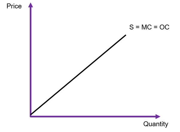
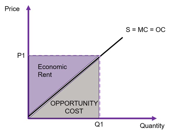
More specifically, if we want to measure the full costs of a policy, we need a full accounting of opportunity costs, what we must give up if we allocate resources towards the policy. The supply curve is the representation of opportunity cost of the project. A supply curve represents the marginal cost (MC) of supplying a good. The supply curve is upward sloping due to the law of supply – as price increases, producers are willing to provide more of a good or service in the market.
Again, to keep things simple in this analysis, we assume that the supply curves are linear as illustrated in Figure 6.10. It can take two forms:
- supply function

- inverse supply function

The distance between the supply curve and the x-axis shows the marginal cost of production. If we want to find the total opportunity cost of production, we need to sum all the marginal costs. Using Figure 6.11 as an example, assuming the producer is supplying Q1 to the market the opportunity cost is the area under the supply curve up to the quantity supplied (Q1), shown by the grey area. The area of  is the total price received by the suppliers. Therefore, the difference between the total received and the total cost of production (the grey area) is the economic rent – or more specifically, the producer surplus.
To evaluate any changes in costs, we must calculate the changes to producer surplus. Producer surplus is the gain to suppliers of a good or service in the form of economic rent. The total shaded area of the triangle and the rectangle in Figure 6.12 represents the total producer surplus. Again, we calculate the area of a triangle, assuming a linear supply curve. When looking at changes in producer surplus the approach is the same as identified in Example 6.2 above for changes in consumer surplus.
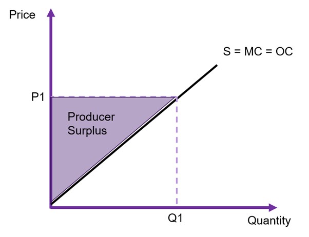
It is important to note that if the supply curve is vertical, there is only producer surplus (economic rent). If the supply curve is horizontal, there is only opportunity cost and there is no producer surplus.
Market Equilibrium and Social Surplus
Assuming the only participants in the market are producers and consumers, the social surplus can be identified as:
(1) 
The market is in equilibrium when demand is equal to supply. If the market is in equilibrium (as shown in Figure 6.13 below), the equilibrium price is  and the equilibrium quantity is
  , found by equating the demand and supply curves and solving algebraically.
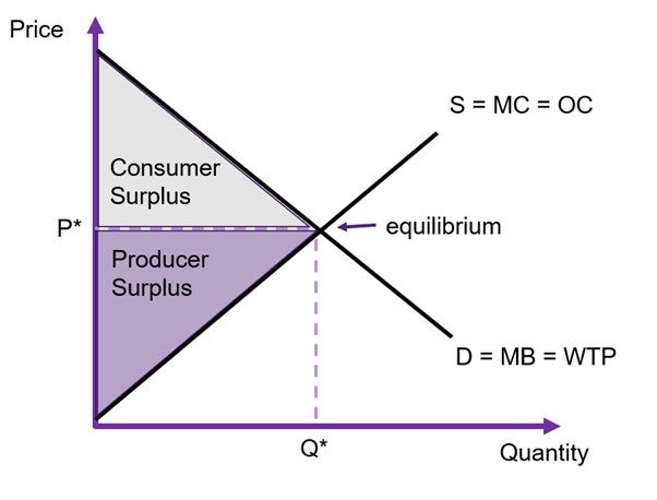
At market equilibrium, the social surplus is at its maximum, and the market is allocatively efficient. Assuming the absence of market failures, the marginal benefit (MB) will also be equal to the marginal cost (MC), implying that the perfectly competitive market is efficient.
We also consider a perfectly competitive market Kaldor-Hicks efficient. Kaldor-Hicks efficiency is where there is no alternative that improves the distribution of benefits as a whole i.e., no potential Kaldor–Hicks improvement through compensation from this situation exists.
Key Concept – Kaldor-Hicks Efficient
A situation where there is no potential for a Kaldor-Hicks improvement via the compensation principle.
When evaluating a policy in a cost-benefit analysis framework, an analyst can use the total change in social surplus ( ) in all relevant input and output markets to measure the impacts of the intervention. Consequently, we need to sum the changes in surpluses across all markets to determine whether a policy or project is overall viable.
(2) 
Elasticity
The demand curve is often unknown to an analyst, creating difficulties estimating the consumer surplus. However, we can identify the elasticity – which measures responsiveness of one variable to changes in another variable.
Key Concept – Elasticity
Elasticity measures the responsiveness of the quantity demanded (or supplied) in response to a change in price.
The point elasticity of demand and supply can be found using the following equations:
(3) 
(4) 
To calculate the elasticities, you need one single point on the relevant curve where you observe both a price and a quantity. The change in quantity over the change in price is the slope of the direct demand/supply curve i.e., use the  format to find the first term in equations (3) and (4).
- When the elasticity is equal to zero (0) it is perfectly inelastic
- When the elasticity is between
 it is relatively inelastic
 - When the elasticity is equal to the absolute value of one ( i.e.
 ) it is unit (or unitary) elastic
 - When the elasticity is between
 it is relatively elastic
 - When the elasticity is equal to
 it is perfectly elastic
The elasticity of demand usually results in a negative value. This is due to the law of demand – there is an inverse relationship between price and quantity demanded. As highlighted above, when we refer to the elasticity of demand, we usually use the absolute value as the negative relationship is implied (indicated by two vertical bars  around the number). Hence, we talk about the absolute value of the elasticity.
Figure 6.14 below shows a comparison of a relatively elastic demand curve and a relatively inelastic demand curve.
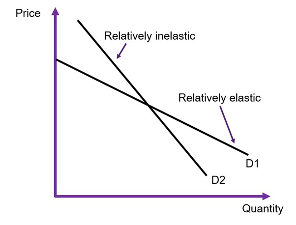
Remember that the slope of the curve and the elasticity is not the same thing! The slope is only one component of the elasticity formula. It is important to note that the elasticity changes are we move along the curve as illustrated in Figure 6.15.
Understanding elasticity is important to evaluate the behavioural response of economic agents to an intervention in the market. However, understanding the elasticity of demand is most important in cost-benefit analysis as it allows us to determine what is likely to happen to the consumer surplus:
- If a good or service is relatively elastic, then when the price changes there is a large change in the quantity demanded. Consequently, there will be a large change in consumer surplus.
- If a good or service is relatively inelastic, then when the price changes there is a small/ potentially no change in the quantity demanded. Consequently, there will be a small to no change in consumer surplus.
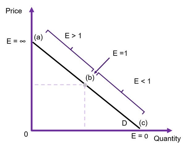
Figure 6.15: Point Elasticities Along the Demand Curve
Example 6.3
Example: Point Elasticity Along the Demand Curve
Suppose you have the information supplied in Figure 6.16 below and you would like to calculate the elasticity of demand at points (a), (b), and (c).
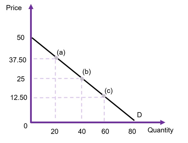
To calculate the elasticity, we first need to find the demand curve with quantity demanded as a function of price i.e., in the format of  . Taking the information from the figure, the curve is:

The intercept of 80 is identified where price is equal to zero (on the x-axis), and the -1.6 comes from the slope of the curve. Specifically, as we are identifying the direct demand curve it would be the inverse of the indirect demand curve slope (50/80) which is observed in the graph. i.e., the slope 
Using the information on quantity and prices  and
and  at point (a) and applying equation 3, we get the following:

At point (b),  and
and  , therefore
At point (c),  and
and  , therefore
This example shows that point (a) is relatively elastic, point (b) is unit elastic and point (c) is inelastic.
A Challenger Appears – Government Surplus
To identify changes in social surplus to a cost-benefit analysis framework, one of the most important things we need to also consider is the change in government surplus. Specifically, from a public sector approach to cost-benefit analysis, we must consider the impact of the government on the market when undertaking a policy.
When the government is an agent in the implementation of a policy or project, we must include changes in government surpluses in a CBA. Therefore, we can expand equation (2) to capture changes in government surplus:
(5) 
Hence, equation 5 shows that changes in consumer surplus, producer surplus, and government surplus can be used to measure the impacts of a policy, project, or program. If the social surplus increases under the policy, then the project is considered a potential Pareto improvement. Remembering that the total change in social surplus in this instance correlates with an increase in net benefits to society, when the  the project should be undertaken.
In this section we will consider some examples where governments may choose to intervene in a market, and how it affects the total social surplus. The assumption is there are no market distortions or market failures. i.e., the market is perfectly competitive (efficient), and interventions are occurring.
Government Intervening in Output Markets
Government Affecting Supply in an Output Market (WTP)
Governments can choose to intervene in efficient markets. If the social surplus increases under the government intervention, then the policy increases the net benefit to society. We can analyse the impact of these interventions by looking at the change in the surpluses. We consider three scenarios: (1) the government provides the good or service, (2) the government reduces the price of the good or service through production costs, and (3) the government controls the pricing of the good or service.
(1) The government providing the good or service to the market.
When the government decides to provide a good or service direct to the market, the government becomes a supplier along with private firms. Suppose the government is willing to provide  units. There are two possible scenarios that depend on the elasticity of demand.
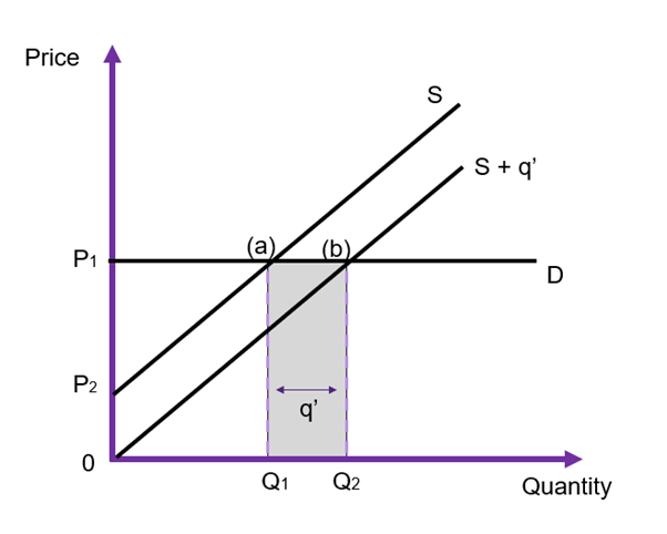
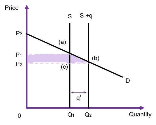
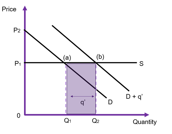
Perfectly Elastic Demand
Assume the demand is horizontal (perfectly elastic) and the supply curve is upward sloping (as shown in Figure 6.17). Prior to intervention, the market is in equilibrium at  and
and  at point (a). Once the government intervenes and provides units direct to the market, the supply curve shifts from
  to
to  Given the demand curve is perfectly elastic (horizontal), the market price is not affected by government intervention – it remains at . We can evaluate the impact of this policy by looking at the changes in the social surplus.
- Consumer surplus is unchanged (zero).
- Producer surplus is unchanged.
- Government surplus (via revenue) is equivalent to
 [or the area of
  ].
].
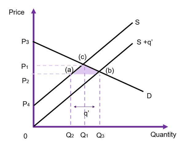
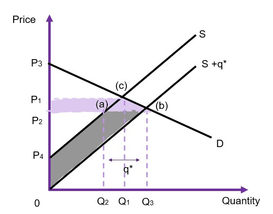
General Case
Assuming instead that the demand is downward sloping, and the supply curve is upward sloping (as shown in Figure 6.18). Prior to intervention, the market is in equilibrium at and at point (c). When the government intervenes and provides units direct to the market, the supply curve shifts from to However, this time the price changes on the market, falling from to  , and the new equilibrium is at point (b) as shown in Figure 6.18. We can evaluate the impact of this policy by looking at the changes in the social surplus:
- Consumer surplus is originally
 , with the drop in price the consumer surplus increases to
  – the difference between the two is the right-angled trapezoid
  .
. - Producer surplus was originally
 , with the drop in price the new producer surplus becomes
  . As the price on the market falls due to the increased supply, there is a crowding out effect for the producers originally in the market (private production falls from to
  ). In the example Figure 6.18, this net change will be positive, however whether this happens will depend on the size of supplied by the government and the elasticity of demand and/or supply.
 - Government revenue will be equivalent to
 [or the area of
  ]
]
Overall, the reduction in producer surplus  is transferred to consumer surplus and there is a positive government surplus through revenue. The net gain in social surplus is therefore
  .
.
In this instance, the government is able to provide a benefit that we can evaluate using the CBA framework using the willingness-to-pay. The intervention has a direct increase to the supply of the good or service along with a decrease in the price. Accordingly in this scenario, consumers are made better off after the redistribution of surpluses.
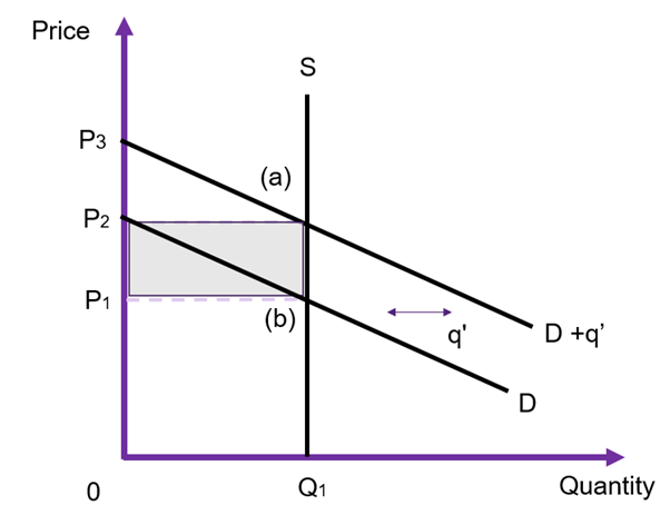
Perfectly Inelastic Supply
Let’s now consider the situation where a government provides the good or service, assuming the supply is vertical (perfectly inelastic) and the demand curve is downward sloping (as shown in Figure 6.19). Prior to intervention, the market is in equilibrium at and at point (a). Once the government intervenes and provides units direct to the market, the supply curve shifts from to  . Given the supply curve is perfectly inelastic (vertical), the market price falls directly from the government intervention. We can evaluate the impact of this policy by looking at the changes in the social surplus.
- Consumer surplus increases from
 to . Consumer surplus therefore increases by
  .
. - Producer surplus decreases from
 to
to  . The rectangle
  is transferred from producers to consumers.
 - Government surplus (via revenue) is equivalent to [or the area of
 ].
].
In this example, the goal of the government intervention is to reduce the price. Applications of this situation are limited however a good example is higher education. Many countries have higher education regulations where often placements are limited to the number of facilities available or private firms seek to maintain prestige. If the government increases supply, it can be via opening new higher education facilities to reduce the price. The overall net gain to society is  which is the gain to consumers minus the loss to producers plus the gain to the government via revenue.
Government Reducing the Price (WTP)
(2) Government Reducing the Cost of Production.
In output markets, the second alternative for government policy is to intervene and reduce the cost of production. This can be through the provision of technology that enhances production or reduction in prices in inputs for production of the output being evaluated. In these situations, it involves a policy that shifts the supply curve to the left (downwards), lowering the cost of supplying the good or service to the market. In these instances, the additional output is supplied by private firms (and not provided by the government).
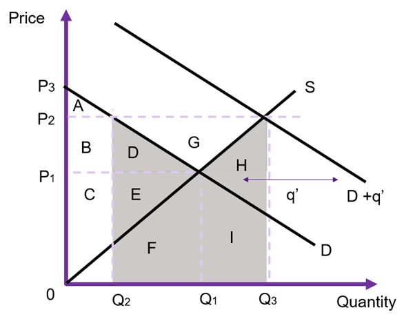
General Case
Assume that the demand is downward sloping, and the supply curve is upward sloping (as shown in Figure 6.20). Prior to intervention, the market is in equilibrium at and at point (c). When the government intervenes to alter the cost of production, private firms produce  additional units direct to the market, increasing the supply from to
  . This drives the market price down from to . We can evaluate the impact of this policy by looking at the changes in the social surplus.
- Consumer surplus increases from to . An increase of

- Producer surplus moves from to
 .[2] The producer gains
  from the reduction in the cost of production reducing the marginal cost. However, the producer also loses which is transferred to the consumers. As the grey shaded area is larger than the purple shaded area, the producer is better off in this example.
 - Government surplus is unchanged as the government is not supplying to the market.
In this example, the total change in the social surplus is the trapezoid  due to part of the producer surplus gain transferring to the consumers.
(3) Government Controlling the Price of a Good
The government can control the price of goods or services in output markets. Examples include price ceilings (maximum price of bread) and price floors (minimum wages) These interventions are complex and can create market failures. We will cover these in more detail in Chapter 8. However, we provide an example on how to evaluate the impacts of a price floor below in Example 6.4.
Example 6.4
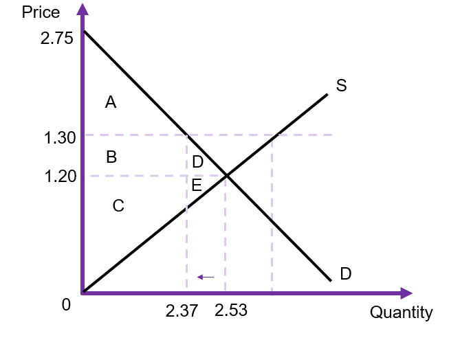
In 2018, the Northern Territory government implemented a price floor on alcohol. The policy aimed to address two factors: (1) residents of NT consume 14 litres our more per year than the average Australian (Skov, et.al., 2010), and (2) the total social cost of alcohol was estimated at $7,577.94 per adult in the NT (Smith, Whetton, & d’Abbs, 2019).
Following the implementation of the price floor, the following data was collected on the wholesale price of alcohol is reported below in Table 6.2.
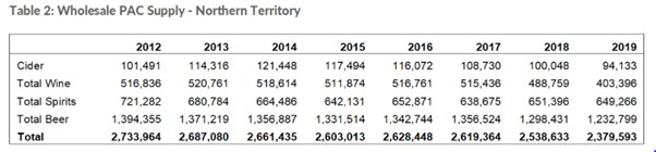
Using this information, we can estimate the change in social surplus from this policy (illustrated in Figure 6.21 below). As the policy is a price floor, the minimum price will be $1.30 and the quantity reduced from 2.53 million to 2.37 million.[3] The deadweight loss of the policy is the area D+E. Hence, we can calculate the social cost of the project – assuming D and E are equal in size, and both demand and supply are linear) of $15,904. Remembering that this deadweight loss exists to offset improved benefits in terms of social impacts of alcohol, the government is attempting to correct the economic cost of alcohol by reducing the consumption of alcohol.
Government Purchasing from Input Markets (OC)
When evaluating the impacts of a policy or project, the government may purchase resources to be used in the project. For example, if a government is planning on building a new road, then the government will need to purchase concrete and steel from the input markets. This means that the government enters the market as a consumer and will affect the demand for the input. To measure the costs associated with inputs, we use opportunity costs. The opportunity cost of a resource used in a policy or project is equal to the change in the social surplus in the input market. Usually, we can evaluate this opportunity cost via the budgetary outlay i.e., the amount spent by the government to purchase the good or service in the input market.
Keeping in mind that resource markets often have horizontal or vertical supply curves. These situations occur if the government is a price taker in the market (such as low skilled labour) or if there is a fixed supply of the resource (such as land). In these situations, we can calculate the expenditure of the government as the opportunity cost for the project.
Horizontal Supply
In the case where the supply curve is horizontal, there is no change in consumer or producer surpluses. The price is unaffected, remaining at as the increased demand from the government shifts the demand curve from  to
to  . The only change in this market is the
  units which is the expenditure on the government. Consequently, in this example, the opportunity cost is reflected in the shaded rectangle in Figure 6.22.
Vertical Supply
In the case where the supply curve is vertical, there is no change in consumer surplus (assuming a parallel shift in the demand curve). The price will increase from to as the increased demand from the government shifts the demand curve from to .
The only change in this market is the  units which is the expenditure on the additional economic rent to the resource that the producer will receive. Consequently, in this example, the change in producer surplus is reflected in the shaded rectangle in Figure 6.23.
Comparing the result in Figure 6.23 with the example above in Figure 6.22, we can see that there is no opportunity cost from this policy intervention. Only producer surplus increased. However, this increase in price should be captured in the CBA.
General Case
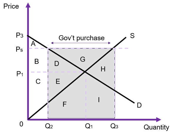
When the input market follows the general market example – downward sloping demand and upward sloping supply, there will be a change in the market price. The size of the change in the market price depends on the relative elasticities.
If we assume the government is demanding the resource, the government intervention increases the demand by the price for the input will increases from to as shown in Figure 6.24. As the government is purchasing units at the higher price of the total expenditure on the input by the government is equivalent to the area of (D+E+F+G+H+I). However, the social cost is (D+E+F+H+I). The difference between the two is G. D+E is the social opportunity cost to other consumers on the market (a loss caused by an increase in the market price). These private consumers have been crowded out due to the higher price i.e., before the intervention units was demanded by private firms and after the increase in the price, private consumers demand units. B+D+G is the gain to producers from providing more of the input on the market. Finally, F+H+I is the opportunity cost to the producers on the market as the government demands increases the quantity traded on the market to  .
.
Given this information, triangle G is the difference between the opportunity cost and the budgetary outlay. This can be seen broken down in Table 6.3 below. Therefore, the price change must be accounted for in computing the opportunity cost of production.
| Benefit | Cost | |
|---|---|---|
| Consumer Surplus | B+D | |
| Producer Surplus | B+D+G | |
| Government Surplus | D+E+F+G+H+I | |
| Net Social Cost | D+E+F+H+I |
If the cost to the government is close to the opportunity cost, we can use the government expenditure to value the impact in the input market (given by G). If the cost is not close to the government expenditure as illustrated in Figure 6.24 (i.e., the area of G is large) then it is not appropriate to use the government expenditure to account for the cost of the intervention. The size of G will depend on the relative elasticities of demand and supply.
One way to calculate the price that should be used in the cost-benefit analysis to reflect the opportunity cost is to average the new price and the old price ( ). This is essentially a proxy shadow price due to the market distortion caused by the government intervention. We will look at shadow prices for other market distortions and non-market goods and services as a later date.
Key Concept – Shadow Price
A shadow price is an estimated monetary price used to value an item, good or service that is not traded on a market, or the market price does not reflect the true value.
In this instance, we are calculating the shadow price by adjusting the changes for the market price caused by the government intervention. We can take the average of the two shadow prices and multiply it by the quantity purchased by the government to calculate the opportunity cost from an intervention in the input market. i.e.,  .
.
Example 6.5
Additional Example: Price Support with No Surplus
Suppose a government wants to protect its agricultural industries – for example wheat farmers. If we consider a price floor as policy intervention, with no surplus on the market we can evaluate the impact of the policy on social welfare. This is often referred to as a price support. The key difference between a price floor and a price support is that when a price floor exists, the excess supply is a problem faced by the suppliers in the market. When it is a price support, the government purchases the surplus product. We can evaluate this type of intervention using the changes in social surplus.
Prior to the price floor, the equilibrium price is and the quantity traded is as shown on Figure 6.25. After implementing the price support the price becomes  . At price the consumers demand units, and suppliers are willing to supply units to the market. The government will have to purchase the grey rectangle. The resulting total social surplus is outlined in Table 6.4. From the analysis, this intervention benefits producers, costs consumers and the government. Whether the overall policy should be accepted will depend on whether the overall change in social surplus is positive.
Drawing it All Together – Changes in Social Surplus and CBA
At this point, we have reviewed and developed our understanding of the players in the input and output markets related to cost-benefit analysis. This chapter identified how we can use the change in total social surplus to evaluate a policy or project. Taking a public sector approach to interventions, we introduced the role of government in influencing a market to improve social welfare. Under these circumstances we can now evaluate whether a project is worthwhile based on the changes in social surplus across input and output markets involved. Consequently, we end this chapter on the following equation:
(6) 
Case Study: Eurovision Song Contest and Economic Surpluses

This paper by Fleischer and Felsenstein (2002) provides insights to how economic surpluses can be used in a cost-benefit analysis. The authors evaluate the benefits and costs associated with Israel hosting the 1999 Eurovision Song Contest. The goal of the analysis was to capture tangible and intangible aspects of Israel hosting the event. The authors calculate the producer surplus, consumer surplus, and government expenditure. The process includes estimating the demand curve (WTP) to calculate the consumer surplus and identify the opportunity cost of diverting resources from their normal uses towards the broadcasting of the contest.
Revision
Summary of Learning Objectives
- Allocative efficiency occurs automatically in a competitive market at the point where marginal benefit is equal to marginal cost. At this point, no one individual can be made better off without making someone else worse off. Consequently, any project that has a net social benefit greater than zero improves efficiency.
- Kaldor-Hicks compensation criterion states that a policy is more efficient if there is a net gain to society as this enables compensation between winners and losers of a project, resulting in a net gain to society. When compensation occurs, it leads to an actual Pareto improvement.
- The demand curve is equal to the marginal benefit curve in an efficient market. The demand curve represents the willingness-to-pay. The supply curve is equal to the marginal cost curve in an efficient market. The supply curve represents the opportunity cost of production. The market equilibrium is where demand is equal to supply (MB=MC).
- Governments can implement policies that intervene in an output market. In these instances, we can use the willingness-to-pay to measure the benefits of the policy.
- Governments can implement policies that intervene in an input market. In these instances, we can use the opportunity to measure the costs of the policy.
References
Northern Territory Government. Department of Industry, Tourism and Trade. (2021). NT Wholesale Alcohol Supply for 2012-2019. Retrieved from https://industry.nt.gov.au/economic-data-and-statistics/business/wholesale-alcohol-supply/wholesale-alcohol-supply-data
Fleischer, A., & Felsenstein, D. (2002). Cost-benefit analysis using economic surpluses: a case study of a televised event. Journal of Cultural Economics, 26(2), 139-156.
Skov, S. J., Chikritzhs, T. N., Li, S. Q., Pircher, S., & Whetton, S. (2010). How much is too much? Alcohol consumption and related harm in the Northern Territory. Medical Journal of Australia, 193(5), 269-272.
Smith, J., Whetton, S. & d’Abbs, P. (2019). The social and economic costs and harms of alcohol consumption in the Northern Territory. Darwin, Menzies School of Health Research.
- Indirect or secondary markets are those which are indirectly affected by a project. In most instances secondary market impacts are sufficiently small that there is no need to account for them in a CBA. ↵
- Note that 0 (zero) may not always be the intercept for the supply curve. It was selected for this example to keep it simplistic ↵
- Assuming the intercept of the demand curve is $2.75 and the competitive market equilibrium is $1.20 ↵
